Today, we’ll examine how you can visually enhance your search results page so that it takes users as little time to find the right product as possible.
A search is an important tool for large websites offering a large number of products or services. This tool allows the user to find the product they need without leaving the web page. Website search allows for a quick way to find products and explore all the items that meet your query without having to figure out how to navigate the website.
Search results can be shown as a separate page or displayed on the current one. Either way, you should consider the following recommendations:
Keep the search query
The user should be able to see what they’ve entered earlier.

Displaying the search results
Keep the search bar visible when displaying the search results. This is important for repeated searches, as the user may need it again.

Number of found items
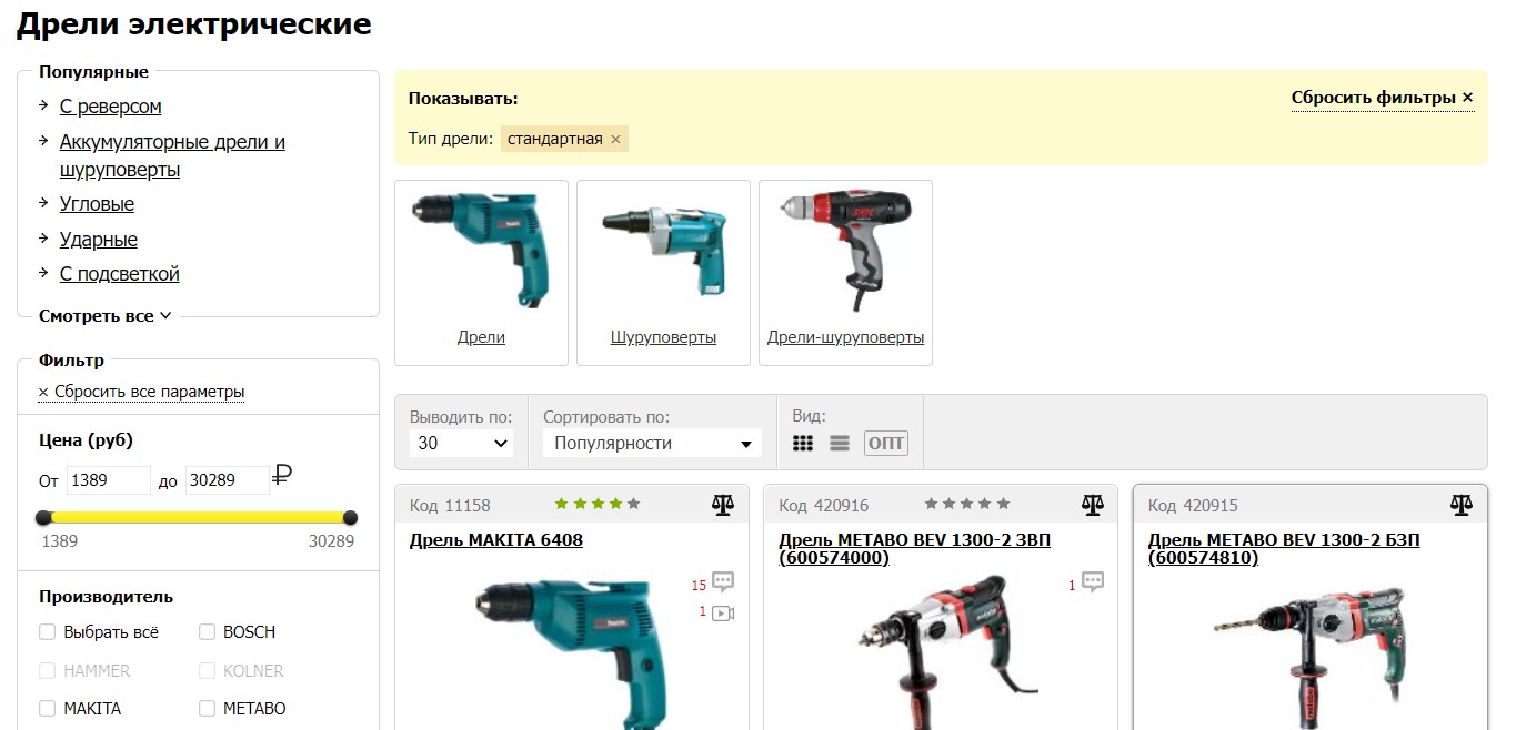
Show the number of found results. The user should be able to see the number of items found to better understand what range of products is available to them.

Visually separate the search results from each other
The information shouldn’t be clumped together. Add padding between items and highlight titles. For online stores, it’s best to display product cards.
Zero results
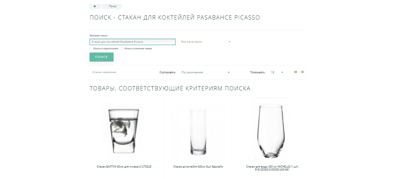
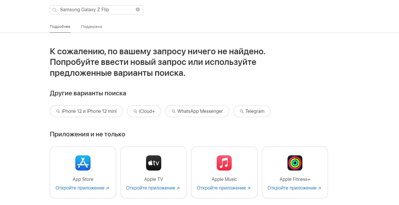
Don’t leave the results page blank. Suggest popular products — for example, by displaying the blocks “you may be searching for,” “similar searches,” and “popular products.” The user may be interested in the suggested products.
An empty page can scare the user away, driving them to a competitor’s website.

A page with zero search results is an opportunity to support your users by offering them suggestions and tips on how to reframe their search queries.
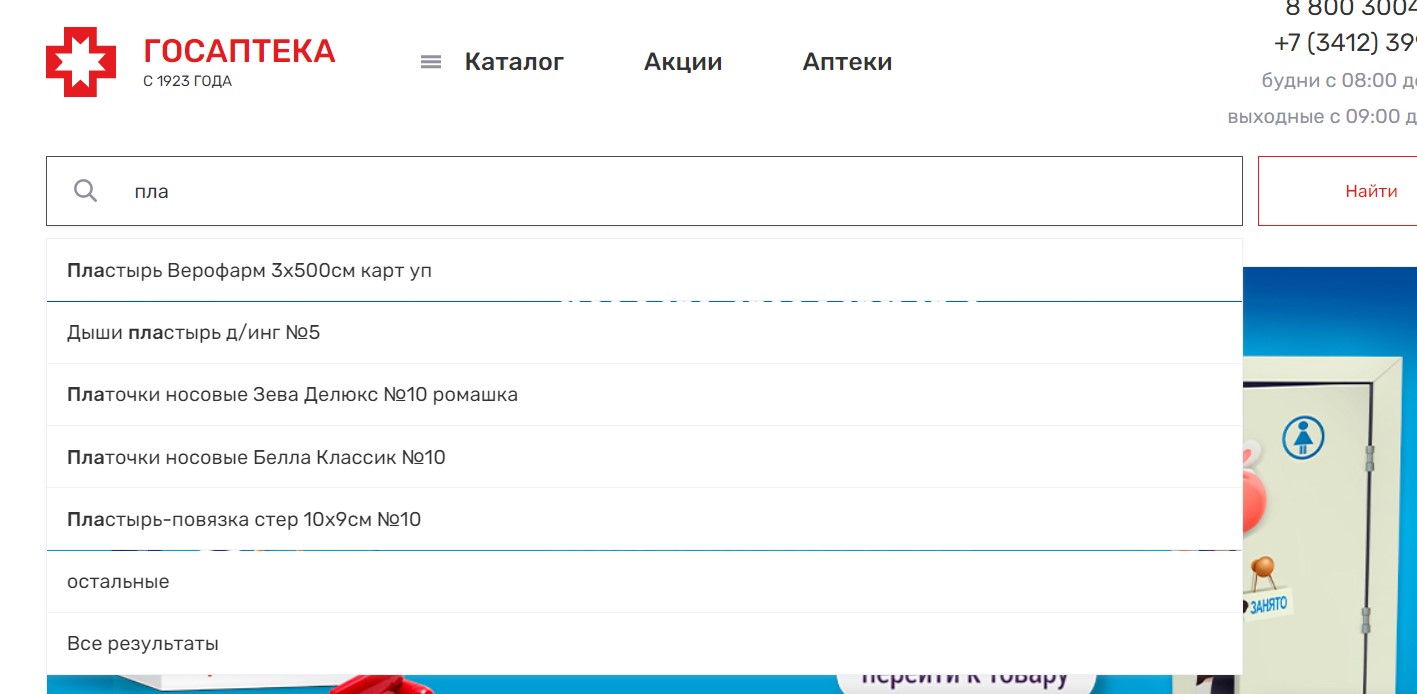
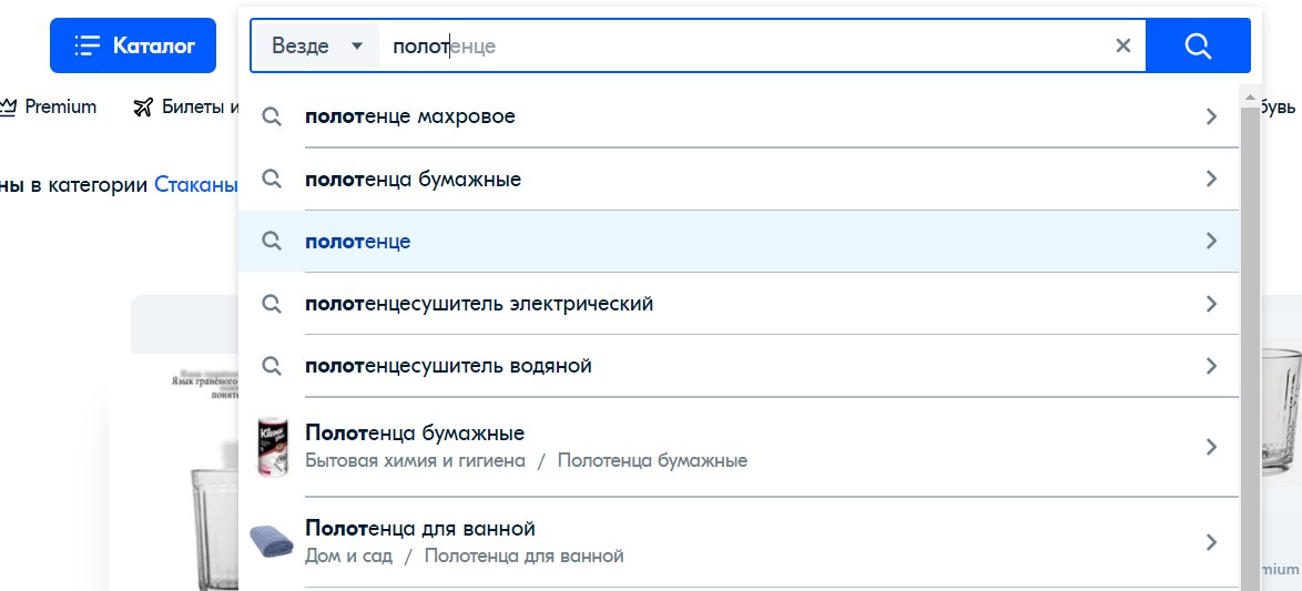
Use search prompts
Help your potential customers to enter their requests faster. It’s convenient for the user to get category prompts and see relevant products.
Keep navigation elements
Keep the basic navigation elements displayed on the results page and design the page using your website template. The search results page should retain your website’s main menu, footer, breadcrumb trail, and other elements.
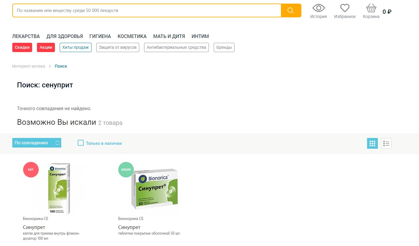
Be prepared for typos
We all make mistakes. The users visiting your website are no exception. To provide a better user experience, offer to correct misspelled words or show the right products right away.
A website’s functionality and a streamlined user interface make up a powerful engine that improves your ability to attract more buyers who may later become your regular customers. The search results page is an important component of any website. The need for impeccable design and functionality is demonstrated by a simple fact: visitors will leave your website if they’re unable to find the right product.


